Sunday 5 December 2010

Possible Typography ideas

After looking through the thousands of fonts on DaFont.com, we as group finally selected these four fonts as our possible final choice of typography;
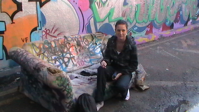

Idea 1

We short listed this font because it gave off an urban, city location feel due to its grafitti like appearance. This is demosntrated through the uneven positioning and alternation between bold and thin like appearance. Although this type of typography would work well in representing the urban, gang nature of the film, it does not convert to the codes and conventions of a typical British drama font or being plain, bold and simple.

Idea 2

We considered this typography as it fits to the codes and conventions of a typicla British drama typography. It is plain, bold and clear and therefore quite formal and striking. Although it does not hint to the 'living on the streets' narrative our teaser trailer surrounds, when placed against relevent imagery and colouring, the group agreed that the typography should compliment the promotional package well.
Idea 3

As a group we felt this typography was very effective as it combines the clear, bold font criteria with a 'gritty' appearance. The scratched out effected across the typography really appealed to the group beause it reminded us of the This is England typography as it uses a similar appearance. However we also felt that this effect could also be associated with the horror genre and therefore may not be the best typography to use as it would not represent the genre we have chosen for our narrative.
Idea 4
This font also has a grafitti like appearance because of its jagged font and bold outline. However we felt the emphasis on the graffiti style resulted in the font looking too inforal land child like. This is not the style we are looking for in typography as our aim is to make our promotional package look as authentic and professional as possible.

After looking at hte pros and cons of these final typography choices, we agreed tha twe shall use choice number 2 as our final typography. This is because it perfectly fits the criteria of a typical British drama typography.

Friday 3 December 2010

Photoshoot Day 2

On the 24th of November our media group headed up to London to do photography which would be used in our promotional film poster and website. We asked a curent UCA student Katy Fields to do the photography for as she has expertise in this area. This is evident in our AS coursework because she also took the high quality photographs which were used in our film opening we created last year. Here are some photos from the photoshoot;


Once our photoshoot was complete we then edited the photos to create a product we were all happy with. Katy helepd us when working with the Photoshop software because she has greater experience of the programme in comparison to us. Here are some of the finished products;


Codes & Conventions of British Drama Websites

As part of our research we looked at 4 existing British drama websites so that we could pick out the codes and conventions so that we can apply them to our own promotional package coursework;


After analyzing these four British drama promotional websites, here is the list of codes and conventions we believe they mostly stick to;

Codes & Conventions of British Drama Film Promotional Websites
  • An audio track is playing in the background of the website which is appropriate to the theme of the film
  • The title of the film is placed on the left hand side of the screen
  • Links are clear and in a font which contrasts to the background
  • Images of the main character or characters are featured
  • An award or positive comment by an external source is mentioned somewhere on the page
  • if the trailer is on the page it is placed as the main feature of the webpage
  • links to buying the film's merchandise stand out in comparison to other links
  • the location of the film is featured in the background image or images
  • All inks are easily accessable
  • production companies and other businesses invovled in the making of the film are mentioned towards the bottom of the page
Now that we have identified these codes & conventions we now must apply them to our own promotional website so that it successfully meets the criteria to be reconised as a British drama film. However it may be difficult to stick to ones such as advertising merchandise as we have not created any and this conventions is gerenally for big blockbuster films.

Kidulthood Deconstruction;

Whilst coming into the final days of editing our teaser trailer, I have been keen to make sure we don't stray from our original ideas too much and make sure that we keep our genre clear to the audience.

Due to this, I watched Kidulthood and have deconstructed it so that we can keep clear on the codes and conventions of British Dramas;

From deconstructing the film I found that;
  • Dealt with serious hard-hitting issues throughout. Especially suicide at the beginning and then a murder at the end
  • POV shots throughout to show the audience what its like and create a sense of sympathy with the characters
  • Lots of over the shoulder shots, created a sense of following the characters
  • Set in west London - Location was key, very busy and easy for characters to get lost in the crowd
  • Contrasted characters home life against each others
  • Graphic sex, violence, binge drinking and Drug use. Behaviour clearly deemed acceptable
  • Characters wearing very casual loungewear clothes
  • Overtly sexual girls
  • Teenage pregnancies
  • Fitted the stereotype of how youths are portrayed within the media
  • Changes of high angle and low angle shots to show which character has the power or authority at that time
  • Race is a clear issue throughout
  • Music reflects the urbanisation of the location, very 'grime' style and heavy beats
  • Low key lighting/natural lighting used to show reality of the situation
  • Diegetic sound is usually used throughout except where the characters are moving locations, shows the harsh reality of their situation
  • Everyone trying to be older/act older than they are. Age is a key issue.
It is important we remember the codes and conventions of British Dramas, such as Kidulthood, when finalising our trailer so that the audience is clear on the genre and that we continue to challenge ourselves with this genre.

Typography from Existing British Dramas

Before deciding on our own, we must look at typography used in existing British drama films so that we can use a font of similar colouring, positioning and style.

Trainspotting uses a clear, easy to read font. The simplicity of the font is enhances by the plain white colour against the plain orange background. The type of font uses also looks quite personal because it has similarities to a person's 'typical@ handwriting. This suggests that the film is focused on one character's point of view.

London to Brighton uses a simple but formal appearing font. The formality of the typography is also shown through the mature black and white colour scheme. This suggests to the audience that the film is very serious. Also by having 'Brighton' in bold draws eye towards it and then therefore the audience is encouraged to read from top to bottom, taking the whole film title in. This is also interesting as in a standard UK map London is above Brighton and therefore it's as if the audiences eye is traveling from London to Brighton by reading downwards.

This is England's font appearing very striking and 'in your face' simply because of the use of capital letters. This may be because capital letters have connotations of importance or aggression and therefore suggests that the film is about very loud and bold characters. the gnere of the film is heavily shown through the use of British patrotic colours red, white and blue which also indicates where the film is set. Although the font used is simple and clear, it also appears to have bits scratched out which creates a rough texture. This may indicate to the audience that the film is about gritty, real topics which are infused with characters with maybe rough, imperfect personalities.

The font used in Adulthood's typography appears quite informal and modern. This may suggests that the film itself is quite modern and it focuses on younger characters. The most interesting part of the typography is how the letter 'd' is in lower case where the rest are in capitals. To me this suggests that the 'd' may represent an underdog character that does not fit in with the rest of society, the main story of the film.

The silver colouring of the background is used to match the word 'machine' because of the colour's metalic connotation. The type of font used also seems quite industrial because of the jagged edges of each letter. This ties in with the typography's indsutrial, metalic theme. The white coloured font used on top of a silver background is used to make the font stand out which makes it easier to read by the audience.

Overall, by looking at existing fonts i have discovered similarities between each film whic hI feel should be incorporated in our own coursework typography. The vast mjaorty use simple, easy to read fonts which are plain and bold. The titles are usually in capital letters as well to give a stronger impact on the audience. There is also minimal colours used so that there is a contrast between the wording and the background. By incorporating these attributes into our own, we will be successful in creating a typical British drama typography which will suit our teaser trailer film

Wednesday 1 December 2010

Deconstruction Teaser Trailer of Trainspotting

Below is the teaser trailer for the very famous British Drama film Trainspotting. The trailer itself lasts very close to one minute.


The protagonist speaks directly to the camera, this breaks the 4th wall and creates a feeling for the viewer that they are part of the film and that they are involved in this scene. The talking that he does gives absolutely nothing away in regards to the storyline. The audience knows absolutely nothing about the character and his personality. Although, his relaxed nature in regards to the train 'coming anytime now' implies that he is very laid back and just doesn't realise the seriousness of the situation. Or that if he does, he doesn't care. That he has lack of concern for his own life. This is further reflected in the film's storyline.

The sideways on shot of him lying on the railway track reflects just how slim he is. As this is shown shortly after he states 'Don't let drugs screw you up', it implies perhaps that he has a drugs problem or did in the past. The direct talking to the camera/audience can be quite intimidating as he is staring the camera face on. This feels rather invasive for the viewer. However, the character is laughing and joking which makes him seem more relaxed and therefore much less intimidating.

The simpleness of this trailer is probably the most effective thing. Along with the direct talk to the audience. However, that would mean breaking the fourth wall and this can be something that is very difficult to get right but incredibly easy to get wrong. However, I'm not sure if it interesting enough to encourage a large number of people to look out for the full theatrical trailer or go and see the film. In our trailer, we need to be more creative and we want to push our creativity to using a large number of camera angles and editing techniques. I feel if we followed the style of this teaser we would not be able to 'pull it off' as well as this one was.

Trailer Tagline; Big Issue

Big issue is a magazine that is created especially to help those that live on the streets or are homeless to 'help theirselves'. they are a charity that helps to provide opportunities to these unforuntate people. They have very iconic taglines for their magazine. Due to this, I have decided to look into this as we may need a tagline for our film.

1. "A hand up, not a hand out"

2."Street trade not a street aid"

3. "Coming up from the streets"

4. "Good homes, good jobs, good health, good life."

5. "Working, not begging"

6."Your small change will make the difference"

Looking at the six of these, they are rather short. No more than 8 words. The shorter ones appear to be the more effective ones. They are easy to remember and usually rhyme which makes them catchy. The taglines also appear concerned with breaking the illusions people have of homless people (street trade not a street aid). this may be something that we want to consider for our trailer. We want to break the stereotype that many have of young people that are homeless or living on the street. Perhaps if we came up with a tagline that was more relevant to our character and storyline. As the theme is that all the chaos that happens in the film is only over a short period, perhaps a week or a few days. We have come up with a few ideas that still need work. However, our favourite at the moment is;
"Only on the streets would a week feel like a lifetime.."
This is good as it is quite short and not too difficult to remember and it directly addresses the fact that the film is based around living on the streets. However, as it doesn't rhyme it may not be as effective as other ideas we could come up with.
We will brainstorm some more ideas and develop these as we develop our promotional package.

Trailer Development; Developing Shot Ideas

As we have begun to film our teaser trailer and are gathering shots, we are at a point where we feel the footage we have is good but we want to develop it as we know when we develop our editing, most of the shots will be dramatically cut in length. As a group, we feel that currently our trailer is lacking some 'oomph'. Something that will leave a lasting impact on the audience. Obviously, we have not finished filming and we have got some scenes already planned to shoot but we are still trying to develop some more creative shots.
I have decided to look into shots from established films for inspiration.

Below are stills from a number of British Drama films and other genre films that I feel are very effective.

Fish Tank;
This shot of Mia is slighting raised (almost a high angle shot) makes her look very vulnerable. This is emphasised by the streak of black eyeliner running down her face which clearly shows the viewer that she has been crying. The contrast of the black eyeliner against her pale skin is very effective. The closeness of this shot creates a feeling of intimacy with Mia and this may be useful to use within our trailer as we want the viewers to feel sympathy towards our character at times. However, we may contrast a shot like this (which makes the protagonist look vulnerable and weak) with an low angle shot of Daisy looking aggressive and violent which will throw the audiences' sympathy.

Thirteen;
This shot is effective as it contrasts greatly against the rest of the trailer, it is especially noticeable because of the change in colour in comparison to the rest of the trailer. This would be easy for us to re-create as we change the colour gradient of shots on imovie. Also, as the main character on the left is noticeably much lighter than the background it makes her stand out more drawing attention to her facial expressions and the situation. This may be effective for us to use within our teaser trailer. We are developing some shots of our protagonist lying on the grass and taking some shots from directly above (aerial shot). The green background of the grass will be effective as most of the other shots are dull or grey.

8 mile;

Although 8 mile is an American film, it explores the difficulties of homelessness and living on the streets. Therefore, it is important for us to look to this film for inspiration. This shot is very useful as symbolism as it reflects that the protagonist spends his time, watching and observing the desolate city he lives in. It is effective at portraying how 'run-down' the area is and the effect this has on the local people, as the audience can see out the window at the run-down area, it creates sympathy and understanding towards the protagonist. The audience begins to understand that the protagonist see's this on a daily basis. The fact he is sat on a bus is also very symbolic as it is a very normal and every-day thing to do and the audience can understand the mundaness of travelling to work. Although it may be difficult for us to film effectively on a bus (it would move and the shot would be unsteady) we may be able to recreate a shot similar to this. Perhaps with her looking out a building window or through a window to an ideal situation. Reflecting what it is that she longs for.


Requiem for a dream;
This shot shows one of the female main characters in the foetal position. This holds connotations of being vulnerable and childlike as babies are. This reflects that at this point in the film she is weak and needs someone to protect her. The aerial shot that this is taken from gives a feeling of superiority to the viewer. this has a very powerful impact with the viewer as their sympathy is thrown towards this character. Also, the mess and desolateness of the characters surroundings reflect that she has given up and does not care for these insignificant things. This could be a powerful shot for us to use within our teaser trailer. Although, it would be very difficult for us to get a shot from such a higher angle as we do not have a jib or other equipment to create this successfully. However, we may be able to develop a similar shot from a different angle. We will have to explore this as a group.

Sunday 28 November 2010

Website Ideas

Here are 2 ideas I came up with for our website. I used the website creator Wix.com which I found really east to use because of the lack of html coding and the focus on the "drag and drop" idea of website creation.


These font on these design won't be exactly what we want as we have picked our typography yet. I prefer the bottom design because the writing is a lot more clearer due to the less busy background picture. Also the use of social networking site links make the website seem professional due to its ability to reach a wider audience.

Friday 26 November 2010

Promotional Package; Website Development

Below is a basic idea for our website. This was mainly so that I could try out the website creating software and discover how much creativity we could have. This is a very basic idea that will need a lot of work. We are just trying to come up with a number of ideas so that we can chose the best one as a group.


This is a very simple layout. However, there are flaws in the design. The layout does not take the viewers eye towards any particular important thing (especially the title). This will definitely be something that we need to work on.

Sunday 21 November 2010

Codes & Conventions of British Drama Posters

In order to create a poster for a teaser trailer that fits the British drama genre, we must first look at existing posters of the genre and identify the codes and conventions. These need to be identified so we can stick to them when developing our final design.


After comparing these posters we came up with a list of codes and conventions for a British drama poster;

- Clear, easy to read font is used
- Protagonist is featured on the poster
- Any character featured on the poster is looking directly at the camera
- Title is in the center of the thirds
- A tag line is used
- Font colour contrasts with the background colour
- Patriotic British colours often used
- The clothing which the characters are wearing in the poster gives away their personality
- Background usually features an attribute of city life/the film's location
- Credits are placed at the bottom
- Other films created by the director are sometimes mentioned
- The first item the eye is drawn to is the title

By identifying the codes and conventions we can now start developing our original poster ideas. If we stick to these conventions, then our final design should be a successful poster for the British drama genre.

Tuesday 16 November 2010

Location Photos.

Here are some photos from the under ground, graffiti tunnel we will be using to film a lot of our footage for our final coursework piece;


Sunday 14 November 2010

Initial Poster Ideas

Below are a few poster ideas which we drew ourselves.;

Design 1

This design is based on the photos which we took in our photo shoot in London. The design includes our actress staring at the camera to intimidate the audience which gives an insight to the type of character our protagonist is as well as hinting to the genre of film being portrayed. the design also incorporates a graffiti style font being used to emphasise the suburban setting of the film.

Design 2

The main idea of this poster is that it will be a photograph of a cardboard sign saying "Thick Skin" which we would have written on before hand. However the problem with this design is that it doesn't give much away about the narrative or genre. This can be a positive thing as it entices the audience however I feel it needs to give away slightly more so a better understanding of the film is gained.

Design 3

This poster design is also based on our previous photography as well as the HOMELESS image we found when creating a mood board. Although it is poorly portrayed in the drawing, we would like the title "Thick Skin" to run along the wall just like in the HOMELESS image. The design also includes our protagonist which introduces the character. We will ensure any font used will stand out against the poster so that it is clearly read. This will be done by using a contrasting colour and striking font style.

The next step in creating our film poster is develop our initial ideas. We are planning on looking at codes & conventions of British Drama posters as well as speaking to a graphic designer who can help us create our ideas whilst offering any additional advice which will aid our final design.

Tuesday 9 November 2010

Teaser Trailer; Anchorage Development

Within our trailer it may be necessary to have effective anchorage (wording/key information) at some points during the teaser trailer. As use of anchorage will be key for our teaser trailer, I have begun to look into different British Drama films and the use of anchorage within them.

Fish Tank;

To the left, is the anchorage used within the fish tank trailer, shown in the trailer from left to right in order. It is important to remember that this is used in a theatrical trailer not a teaser so there is longer time and more narrative to give away within the time given. It begins with stating nominations and awards that the film has received. This is encouraging to the viewer as it leads them to think that the film will be worthwhile watching. However, this technique may have been necessary as the director and actress are rather unknown. Also, the genre of film is of a niche target market and so perhaps they could not to use their reputation to encourage people to view the film.


The anchorage used gets more frequent and has a shorter time on screen towards the end of the trailer as the tempo of the music and tension is increased. This could be effective in our teaser trailer to create excitement to watch our film. However, we need to look into how the anchorage can be used to its best effect and what wording to use.


As you can see to the left, the wording (not reviews or awards) used is; "All her life, She kept the world out. All around her, Life came rushing in. How much can you give, How much can you take, FISH TANK". the use of the rhetorical questions are very effective as they push the audience to consider how they would react if they were her and this involves the audience and may make them feel attached to the film and would, encourage them to see the film. The anchorage tells the audience a lot about Mia as a character and gives an idea of the storyline. It reflects that the issues within the film have been happening 'all her life'. It indicates to the audience that what happens in the film may be out of her control. The anchorage, together with the mise en scene reflects that life is a constant struggle for the main character. It also indicates, problems with her mother/family and shows her relationship with other characters in the film.


In our teaser trailer we will not have as much time to portray as many issues, and as a teaser trailer we we would not want to. We need to discuss as a group, if we chose to use narrative anchorage, what problems our protagonist face's in our film and if we want to portray this within our teaser trailer. However, the use of short two or three words on screen in concession has a much better impact on the viewer and is much more effective than lengthy phrases for anchorage. Also, there is not much vocal interaction between the characters in the trailer and this may be why anchorage was needed.


London to Brighton;


Above is the anchorage used within London to Brighton's trailer, there is much less in comparison to Fish Tank. However, during the trailer there is diegetic and non-diegetic conversations between characters that gives away a lot of narrative and sets the tone of the film. Again, the director has decided to use reviews from film critics as a way to attract the audience. This is clearly an effective technique, especially from respected people within the film industry. The anchorage used has been shown on a black/out of focus background. This helps he viewer to focus on the writing on screen and not what is going on in the background.
There is a gap in the middle from anchorage on screen and again, the frequency increases towards the end of the trailer as the tension comes to a head.
The interaction between characters flows from diegetic conversation to non-diegetic sound where the conversation continues but the mise en scene has changed to a different point within the film. The lack of anchorage has a good impact on the viewer as it is more memorable and stands out more to the audience.

It may be effective within our teaser not to have any anchorage at all apart from the title as this could create deeper interest for the film due to curiosity. However, the film may not be established enough to be able to rely on this method to work. It is important that we consider if the approach is too risky.

Having looked at the two trailers and the anchorage used within them, it is important we decide on how much narrative we are going to give away in the acting/mise en scene of the teaser trailer and if it will be necessary to have further anchorage to demonstrate more narrative. However, it is also important that we are careful if we cross 'the 4th wall' as this will compromise the reality and authenticity of the film.

PhotoShoot

While we were filming at an excellent location for our teaser trailer we also took still pictures of our actress to be used for our poster and website. The image quality is not great because we took the stills using the video camera.


In order to use any of these pictures we would have to re-shoot them with a better quality camera so that the photos come out less blurred and the colours would be less washed out. Regardless we feel these photos came out well and that we shall definately incorporate them into the designs for our ancillary tasks.