Design 1
This design is based on the photos which we took in our photo shoot in London. The design includes our actress staring at the camera to intimidate the audience which gives an insight to the type of character our protagonist is as well as hinting to the genre of film being portrayed. the design also incorporates a graffiti style font being used to emphasise the suburban setting of the film.
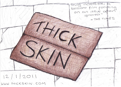
Design 2
The main idea of this poster is that it will be a photograph of a cardboard sign saying "Thick Skin" which we would have written on before hand. However the problem with this design is that it doesn't give much away about the narrative or genre. This can be a positive thing as it entices the audience however I feel it needs to give away slightly more so a better understanding of the film is gained.
Design 3
This poster design is also based on our previous photography as well as the HOMELESS image we found when creating a mood board. Although it is poorly portrayed in the drawing, we would like the title "Thick Skin" to run along the wall just like in the HOMELESS image. The design also includes our protagonist which introduces the character. We will ensure any font used will stand out against the poster so that it is clearly read. This will be done by using a contrasting colour and striking font style.
The next step in creating our film poster is develop our initial ideas. We are planning on looking at codes & conventions of British Drama posters as well as speaking to a graphic designer who can help us create our ideas whilst offering any additional advice which will aid our final design.


ReplyDeletenice