Within our trailer it may be necessary to have effective anchorage (wording/key
information) at some points during the teaser trailer. As use of anchorage will be key for our teaser trailer, I have begun to look into different British Drama films and the use of anchorage within them.
Fish Tank;
To the left, is the anchorage used within the fish tank trailer, shown in the trailer from left to right in order. It is important to remember that this is used in a theatrical trailer not a teaser so there is longer time and more narrative to give away within the time given. It begins with stating nominations and awards that the film has
received. This is encouraging to the viewer as it leads them to think that the film will be worthwhile watching. However, this technique may have been
necessary as the director and actress are rather
unknown. Also, the genre of film is of a niche target market and so perhaps they could not to use their reputation to encourage people to view the film.
The anchorage used gets more frequent and has a shorter time on screen towards the end of the trailer as the tempo of the music and tension is increased. This could be effective in our teaser trailer to create excitement to watch our film. However, we need to look into how the anchorage can be used to its best effect and what wording to use.
As you can see to the left, the wording (not reviews or awards) used is; "All her life, She kept the world out. All around her, Life came rushing in. How much can you give, How much can you take, FISH TANK". the use of the rhetorical questions are very effective as they push the audience to consider how they would react if they were her and this involves the audience and may make them feel attached to the film and would, encourage them to see the film. The anchorage tells the audience a lot about Mia as a character and gives an idea of the storyline. It reflects that the issues within the film have been happening 'all her life'. It indicates to the
audience that what happens in the film may be out of her control. The anchorage, together with the
mise en scene reflects that life is a constant struggle for the main character. It also indicates, problems with her mother/family and shows her relationship with other characters in the film.
In our teaser trailer we will not have as much time to portray as many issues, and as a teaser trailer we we would not want to. We need to discuss as a group, if we chose to use narrative anchorage, what problems our protagonist face's in our film and if we want to portray this within our teaser trailer. However, the use of short two or three words on screen in concession has a much better impact on the viewer and is much more effective than lengthy phrases for anchorage. Also, there is not much vocal interaction between the characters in the trailer and this may be why anchorage was needed.London to Brighton;
Above is the anchorage used within London to Brighton's trailer, there is much less in comparison to Fish Tank. However, during the trailer there is
diegetic and non-
diegetic conversations between characters that gives away a lot of narrative and sets the tone of the film. Again, the director has decided to use reviews from film critics as a way to attract the audience. This is clearly an effective technique, especially from respected people within the film industry. The anchorage used has been shown on a black/out of focus background. This helps he viewer to focus on the writing on screen and not what is going on in the background.
There is a gap in the middle from anchorage on screen and again, the frequency increases towards the end of the trailer as the tension comes to a head.
The interaction between characters flows from
diegetic conversation to non-
diegetic sound where the conversation continues but the
mise en scene has changed to a different point within the film. The lack of anchorage has a good impact on the viewer as it is more memorable and stands out more to the audience.
It may be effective within our teaser not to have any anchorage at all apart from the title as this could create deeper interest for the film due to curiosity. However, the film may not be established enough to be able to rely on this method to work. It is important that we consider if the approach is too risky. Having looked at the two trailers and the anchorage used within them, it is important we decide on how much narrative we are going to give away in the acting/mise en scene of the teaser trailer and if it will be necessary to have further anchorage to demonstrate more narrative. However, it is also important that we are careful if we cross 'the 4th wall' as this will compromise the reality and authenticity of the film.


 To the left, is the anchorage used within the fish tank trailer, shown in the trailer from left to right in order. It is important to remember that this is used in a theatrical trailer not a teaser so there is longer time and more narrative to give away within the time given. It begins with stating nominations and awards that the film has received. This is encouraging to the viewer as it leads them to think that the film will be worthwhile watching. However, this technique may have been necessary as the director and actress are rather unknown. Also, the genre of film is of a niche target market and so perhaps they could not to use their reputation to encourage people to view the film.


 Revolver Entertainment is one of the UK's leading ‘All Rights’ distribution companies, shaking up the industry with a unique approach to managing its enviable and edgy slate of Film and DVD releases. Many of Revolver entertainment's productions have been British action films for the youth generation in 'gritty' London such as, Shank and Kidulthood.
  IFC Films is an American film distribution company based in New York, owned by Rainbow Media. It distributes independent films and documentaries. The majority of films distributed were dramas such as spring forward, American gun and fish tank.
 Ken and Paul formed their production company Steel Mill Pictures in 2006 when they produced their first feature film, the Award-winning, critically-acclaimed "London to Brighton". Financed with private equity and completion money from the UK Film Council's New Cinema Fund, the film screened in competition at several prestigious film festivals around the world, winning many awards and accolades.
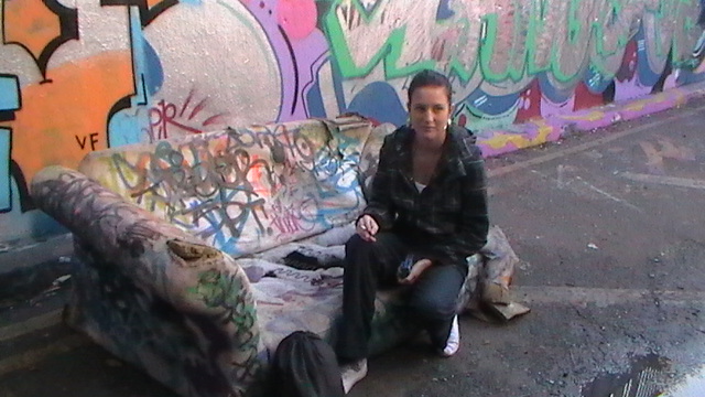
 The word "homeless" written along the wall could be replaced with our film title "Thick Skin". We could maybe use a graffiti style font to make it appear as if it has been spray painted on the wall. This would represent the grimey, London location. The title would be read first by the audience because they tend to read from left to right and therefore we need to sure it stands out against the rest of the poster. We could also recreate this image by having our protagonist sitting on the floor in front of the wall instead. Although I like the use of yellow and and dark tones I feel we should incorporate shades of blue instead as it makes the image appear more harsh and real, emphasising the struggle of being homeless.

